
 The 2006 edition of the Peters Map adds an explanation of the Mercator map, thumbnails of other maps, a web references list, features brighter colors, and upgraded paper stock.
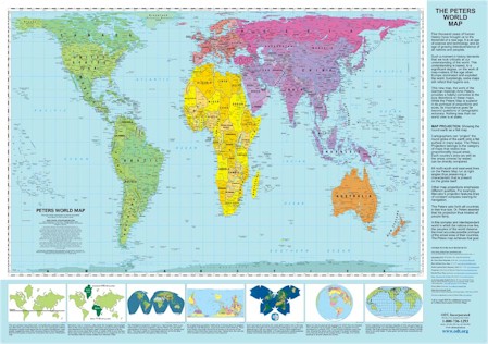
The map shows continents according to their relative size. Traditional maps make lands near the equator look smaller than they really are — for example, South America appears smaller than Europe, when it is really more than twice Europe’s size.
This map is no longer in print. Learn more here.


Twitter
Google plus
LinkedIn